Concept artist and illustrator Marc Gabbana is known for creating highly imaginative and articulate designs for films, games, commercials and advertising with over 20 years’ experience and has contributed work to epic sagas like The Matrix Reloaded & Revolutions and Star Wars: Episodes I & II, Hellboy, and Blade Runner 2049, and can count Audi, Hasbro, Image Comics and Nintendo among his clients. Born in France, he moved to Canada at a young age and later studied architecture for a year before attending the Center for Creative Studies (CCS) in Detroit, Michigan and graduating with a Bachelor of Fine Arts in illustration. Read on as he shares his experience of learning smack in the middle of the Detroit automotive industry and how it landed him some of his first freelance jobs and helped launch his career and develop his signature, colorful and detailed style, before he achieved a lifelong artistic dream of working on blockbuster films. Though he began his career as a traditional artist and always will be one, both 2D and 3D artists can benefit from his advice and experience as he has easily integrated himself into VFX-heavy productions, contributing meticulously designed concepts and not only working with 3D modelers along a pipeline but also using Photoshop and Sketchup Pro to push his own designs further.
GW: You started freelancing in your third year of college which seems to have catapulted your career ever since then. What was that first break and how did it happen?
MG: I graduated from CCS, the Center for Creative Studies in Detroit, Michigan in 1990. Most of the faculty in the illustration department worked in the advertising industry and taught part-time at the school. They often brought examples of their professional work to show us and it was a great way to see the kind of artwork they were producing for Detroit automotive clients. The types of illustrations that I enjoyed seeing were primarily painted in gouache on illustration board, so that is how I learned to paint, as well. A few of my teachers were freelancing and looking for illustrations for ad campaigns - one was for a brightly painted Wheel of Fortune background, another for a novel way to store the spare tire in a Buick, complete with callout descriptions of the parts. Still another one was for an eerily lit, nuclear submarine lurking underwater. They liked my tightly rendered and detail-oriented paintings and asked me to help them out. I happily accepted those assignments! They were paying gigs and I knew that getting my artwork in print would be an important part of my portfolio. By the time I graduated, I had a very professional looking portfolio to show to local Detroit advertising agencies!

GW: You’ve worked on some legendary film sagas like Star Trek, Star Wars and The Matrix. Can you share some experiences and insights on what that was like?
MG: Those were all great projects to work on! For Star Wars: Episode I & II, I did most of the work both from my home in Canada, where I lived at the time, and also at Skywalker Ranch where the other concept artists were working in the art department on the third floor. Those were huge movies at the time and working on Star Wars was the culmination of a lifelong artistic dream. The work I did was different than the traditional, fully painted illustrations I was producing for my other commercial clients at the time.
First, a bit of background on technique. I was creating mostly pen and marker images, and not as many finished color paintings. This allowed me to generate many more ideas since I was working in greyscale with the markers. George liked to evaluate designs in a pure context and not be influenced by color, initially. Even the sculpted creature maquettes and ship models that populated the art department tables were painted monochromatic grey. If a design is solid, then it can later be painted any color. This layered approach to design resonated with me. Doug Chiang and I would speak on the phone and he would give me a list of items to be worked on. For the streets of Coruscant environments, I had a lot of freedom to explore exotic shapes and forms. I lit the scenes with moody lighting to convey a sense of foreboding mystery. I found the solitude of working in my studio in Canada, and later, the creative, collaborative atmosphere in the art department to be different experiences. When working by myself, I was less prone to being influenced by what the other artists were working on and that contributed to a lot of originality in my designs. Working fast and with clear vision with pen and markers allowed me the freedom to conceptualize and iterate on a great number of designs for environments, robots, spaceships and storyboards. I knew that ILM would eventually add the right amount of bling to bring our designs to life on the big screen. For me, the most enjoyable part of the creative process is when I am designing in the moment. I have to trust that the final results on screen will be faithful to my original vision and designs after they are passed on to the other departments. As I still do to this day, I start out with rough pen sketches to lay out scenes and then tighten them up on layout paper and also using a lightbox. The lightly drawn, blue pencil overlay allows me to add greater detail based on the rough shapes I have drawn underneath. I initially explore drawing rough, bold shapes and forms while the overlay allows me to refine details. I ink on top of the blue line with a fine black line using a Pilot Razor Point II pen, erase the blue line, add tone with Prismacolor cool grey markers and finally add highlights with gouache using a fine paintbrush. This was all done in my pre-digital painting days and I felt very much at ease with this technique. My time learning at CCS and the Detroit advertising marker work proved invaluable and prepared me well to visualize ideas with personal style and fearlessness! The images would then be scanned into the computer where I would perform minor levels adjustments to maintain the right contrast.

In my mind, sketches engage the imagination more fully than photoreal images. That is why I gravitate to them. And, I prefer to separate the initial design stage from the the more finished rendering stage where a specific lens, cropping, color and mood can all be explored further.
For my work on The Matrix sequels, I worked in-house at the Wachowskis’ art and design studio in Venice, California, a block from the famous Venice Beach. There, they assembled an elite team of about a dozen concept artists to design the look for the two subsequent sequels: Reloaded and Revolutions. It was a professional and relaxed atmosphere and the other artists and I would interact directly with the directors, the production designer and art director to read the scripts and to discuss the various environments, scenes and storyboards to be conceptualized and designed. We had unprecedented access to the directors and I certainly enjoyed the open communication with the top creatives. The Wachowskis’ love comic books and are great proponents of art, encouraging us to create beautiful, detailed paintings that stood on their own. Technique-wise, I continued to use pen, ink and also painted with acrylics. I remember that for storyboards, they disliked seeing arrows drawn in - those which typically indicate character or camera movement. The images we created were meant to look like finished illustrations, not mere production art. As a group, we produced a huge amount of artwork, both traditional and digital, but sadly, an art book for the sequels never materialized. After working at the Venice studio for three months, the production moved to Alameda where Warner Brothers set up a new art studio, adjacent to the ESC VFX house. I was invited to follow the production there to continue working on the films and I accepted the offer. The studio was located on the decommissioned naval air base and it was there that production designer Owen Paterson and his crew built a mile and a half of freeway for the live-action shoot. It was a thrill not only to work in this new art department but also to visit the sound stages and sets where the directors and actors were filming. My stay in Alameda allowed me to discover and explore the Bay Area and led me to make a permanent move to San Francisco in 2002.
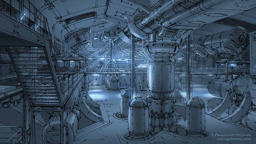
More recently, for the film Star Trek: Beyond, I had the chance to work with the team at Atomic Fiction in Oakland to design environments, props and spaceships. I worked in-house and that allowed our work to remain secure and confidential. I continued to design using traditional techniques. I would then scan my pen drawings and add tone and color using Photoshop. I worked closely with the 3D modelers, which allowed for greater communication as they built the approved designs. I enjoy working with clients who really value traditional media artwork in order to obtain client approval before devoting any resources on 3D modeling and renders. In the end, I am extremely proud of the work that I contributed to those big franchises!


Related News
Beauty in the Beast: Neville Page on Burnout, Mindset & Creative Survival
May 07, 2025
Beauty, Beasts & Better Pipelines: Neville Page on Digital Design & Practical Makeup
May 07, 2025
Capturing Assets & Environments for Call of Duty: An Interview with Gui Rambelli
Feb 10, 2025